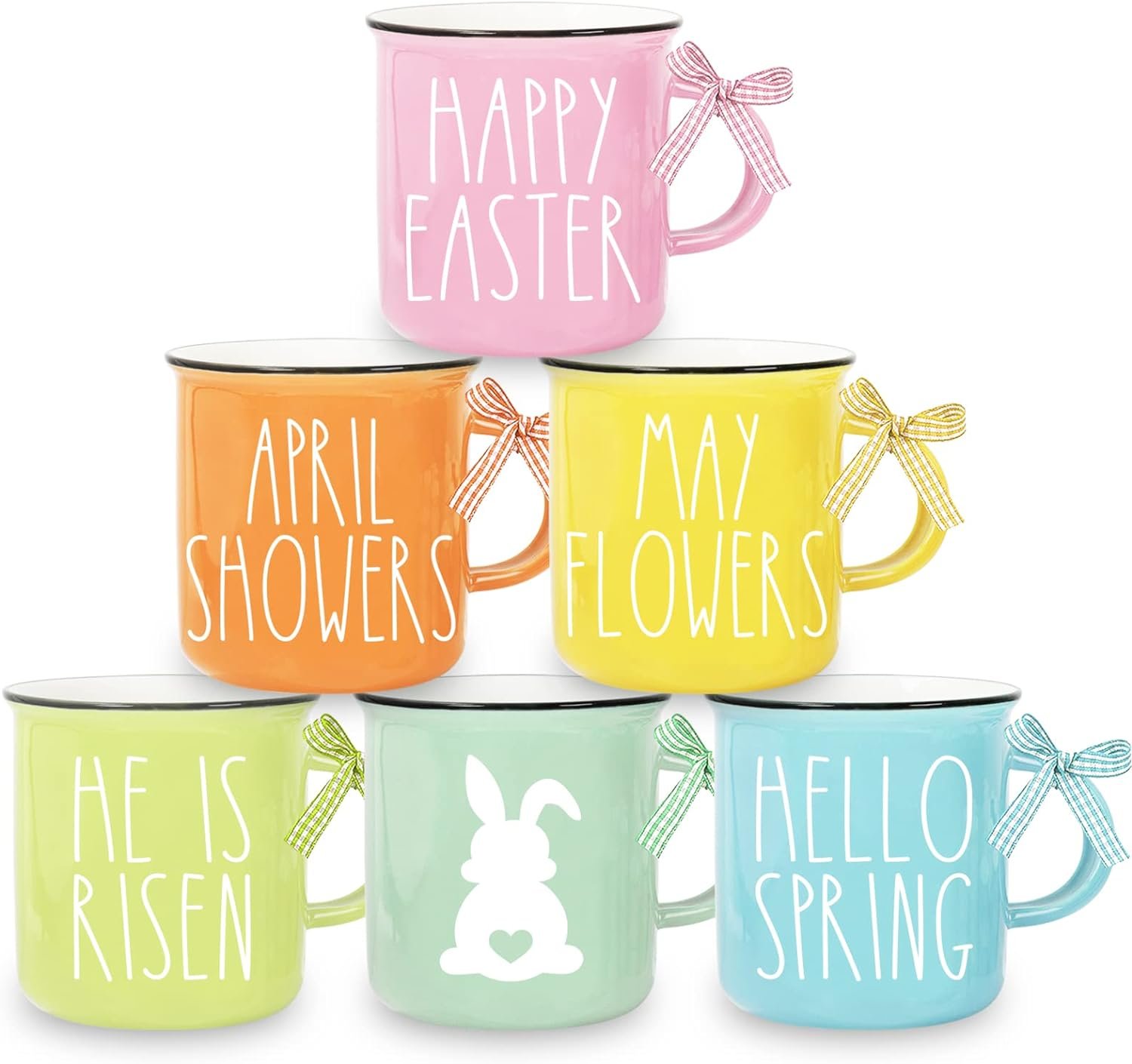

Search for mug color matching and the results will repeat the same claim: send a Pantone reference, receive mugs that match it. That claim is where colour disputes begin. A fired ceramic surface is not a paper swatch, and a claim without a tolerance and a record leaves a buyer nothing to point at when the second run arrives bluer.
This guide is for brand owners, distributors and retail buyers whose colour has drifted between two orders, or between the proof and the delivery. It explains what ΔE measures, why the main processes drift differently, how to approve colour without visiting the factory, and how to write a tolerance into the order.
Key takeaways
- Colour needs three artefacts: a physical target, a numeric tolerance and a signed record. A Pantone number is only an intention.
- ΔE is a distance, not a grade: it means nothing without its formula, illuminant and instrument.
- ΔE ≤ 1–2 is usually indistinguishable; wider readings can still be fine when the tolerance was agreed in advance.
- Decals hold complex artwork most predictably; screen print drifts with ink film and mesh, sublimation with coating and press settings.
- Measure each batch against a sealed master sample, not a photograph; decal fires at about 750–850°C into the glaze.
1. Start with a target, not a Pantone number
At a glance: colour approval rests on a physical target, a numeric tolerance and a dated record, and a Pantone chip is none of the three on its own.
A Pantone reference is shared vocabulary, not a specification for a fired mug. The fan deck describes ink on paper: flat, thin and printed. A mug is curved, glazed and fired, so it reflects light differently and sits on a body that is not paper-white.
Record the Pantone number as intent, then make the target a decorated, fired sample both sides have signed. Our customisation options are approved against that sample, and every later batch is checked against it, which is why the brief asks for artwork, process and care requirements together.
The target has to be reachable: a photograph needs sublimation or a good decal, a flat spot colour suits screen print, and a metallic accent needs its own decal and care limits. Name the process before you promise a colour.
2. What ΔE measures, and what it cannot tell you
At a glance: ΔE is the distance between two colours plotted in a defined space, so it quantifies a difference without deciding whether the difference matters.
CIELAB plots a colour on three axes: L* for lightness, a* from green to red, b* from blue to yellow. ΔE*ab is the straight-line distance between two colours in that space. ΔE94 and ΔE00 reweight the axes to follow perception more closely, especially in saturated and dark colours. A ΔE figure without its formula cannot be compared with another.
Instrument settings matter as much. A spectrophotometer reports against a named illuminant and observer, usually D65 and 10°, and either includes or excludes specular reflection. Change the aperture, the backing or the light and a careful lab can return a different number for the same mug.
The bands in Table 1 describe perception, not a contract. The figure that binds a supplier is the one written into your order.
| ΔE (ΔE*ab) | What most people see | Sensible action |
|---|---|---|
| Under 1 | No difference side by side | Accept |
| 1–2 | Visible only in good light | Accept inside the agreed band |
| 2–4 | Visible to a trained eye | Test against the use case |
| 4–6 | Clearly different side by side | Compare with the master sample |
| Above 6 | Reads as a different colour | Check the record first |
3. Why a fired glaze is not a paper print
At a glance: the body and the firing decide as much of the colour as the artwork does, because the same ink reads differently on a vitrified, semi-translucent surface.
Body whiteness sets the base: porcelain is dense and white, while stoneware carries more iron and a warmer tone. Glaze thickness varies as it pools at the base and thins at the rim, changing how much light returns to the eye. Firing finishes the job: porcelain bodies fire around 1300–1400°C, then a decal is applied and fired at about 750–850°C into the glaze.
Finish changes the reading too. A gloss glaze reflects the room and deepens a dark colour; a matte glaze scatters light and makes the same ink look lighter and flatter. A program that mixes both, as many matte and gloss glaze mugs do, needs a tolerance for each finish.
Substrate explains why cross-category comparisons mislead: the colour problems of a stainless steel tumbler are not the ones you solve on glazed ceramic, even with an identical Pantone reference.
4. Match the tolerance to the process
At a glance: decal, screen print and sublimation drift for different reasons, so one tolerance applied to all three will reject good work or wave through bad work.
Decal printing puts artwork on a transfer film, applies it by hand and fires it into the glaze. It carries complex colour and fine detail best, and drift appears between decal batches and at application, where position and pressure vary. Screen print lays ink through a mesh, one screen per colour, so hue depends on mesh count, ink film and kiln behaviour. Sublimation moves dye onto a polymer-coated body at about 180–200°C, and depends on coating, press temperature, dwell time and wall mass.
Name the process in the specification. A one-colour logo is usually cheapest as a screen print, the standard route for logo mugs; a photograph needs sublimation or a good decal; a pattern with gradients needs a decal, and our lines print from one colour to full-wrap 8-colour decoration. Ink and glaze options sit in our materials, printing and finishes column.

| Process | Colour build | Where drift comes from | What to specify |
|---|---|---|---|
| Decal | Multi-colour, gradients, fine type | Decal batch, hand application, third fire | Decal batch record, application check |
| Screen print | Spot colour, strong opacity | Mesh count, ink film, kiln behaviour | Ink batch, mesh, print order |
| Sublimation | Photographs and gradients | Coating, press time, wall mass | Press settings, coating batch |
5. Approve colour without standing in the sample room
At a glance: remote approval works when both sides measure the same artefacts under the same conditions and each keeps a copy of the result.
Build the approval set in four steps. The digital mockup confirms placement and arrives within 1 hour of a complete brief, but it is a screen image and cannot bind colour. The physical master sample is the reference: decorated, fired and measured at 7–10 days after artwork approval. Keep one sealed copy at the factory and one with you.
The photograph is a record, not a measurement. Shoot on a neutral background with a grey card in frame, under daylight or a D65 lamp, front-on and at about 45°, and measure a flat area rather than the curved wall. Check the sample under two light sources; a match that fails under warm indoor light is metamerism.
The Launch Kit carries the mockup, 3–5 product images, a spec sheet and print-ready dielines, delivered 3–5 working days after artwork approval with 2 rounds of revision.
6. Put the tolerance in the purchase order
At a glance: a tolerance that never reached the order is an opinion, and an opinion is what the argument is about when the second batch lands.
Write six things into the clause: the formula (ΔE00 or ΔE*ab), the illuminant and observer, the instrument and aperture, where the reading is taken, how many pieces are sampled, and what happens outside the band. Attach the approval record as an annex; without those conditions two labs can measure one batch and disagree.
Sampling follows inspection logic: define critical, major and minor defects, then agree an AQL level, with 1.0 and 2.5 as common reference points. A colour reading outside tolerance is usually a major defect, but that grading is your decision. A new body lot, glaze batch, decal supplier or kiln is a reason to re-approve.
Independent verification by a third party such as SGS or Intertek is quoted separately.
| Stage | Record | What it locks |
|---|---|---|
| Sample | Decorated master sample, signed and dated | The target |
| Measurement | ΔE against the master, with settings | The tolerance |
| Batch | Per-batch reading and photo QC report | Continuity |
| Reorder | Re-measurement against the sealed master | Drift control |
Send the target and tolerance with the brief when you request a quote, so the reply confirms what the process holds rather than what a catalogue claims.
7. How MugFactory de-risks colour approval
Colour control sits with the same team that runs the mugs. Our Liling lines fire ceramic, bone china and stoneware bodies, and design, QA and export documentation work in-house, so the approved sample, the production batch and the paperwork stay in one chain.
- A master sample approved before production is scheduled, and retained as the colour standard.
- ΔE and print-position checks across forming, glazing, printing and firing, logged by batch with the kiln records.
- A photo QC report before shipment, shot to the approval protocol.
- A digital mockup within 1 hour of a complete brief; Launch Kit assets 3–5 working days after approval.
- FDA and LFGB food-contact test reports, audit documents and batch traceability records on request.
Test the body and the finish first
You have a Pantone reference and a rough idea of the tolerance you can live with. Send both with the body you have in mind, and we will decorate a sample, measure it and tell you what the process can hold.
FAQ
What is ΔE and why does it matter?
ΔE is the measured distance between two colours in a defined space, so it turns a vague objection into a figure a buyer and a factory can both check. Without a number, approval rests on opinion and a reorder has nothing to be judged against.
What ΔE should we accept on a mug?
There is no universal number. ΔE ≤ 1–2 is often treated as indistinguishable, while decal work on a coloured glaze may be agreed inside a wider band. Treat any figure as industry practice rather than a guarantee, and confirm the accepted band in your quote.
How do we approve colour remotely?
Approve against artefacts rather than screens: a decorated master sample, a recorded ΔE against it with the instrument settings, and photographs shot to a fixed protocol with a grey card. Keep a sealed duplicate at the factory and one at your end, and check it under daylight and warm indoor light.
Why does a reorder look different?
Usually something upstream changed: a new decal batch, glaze batch, kiln position or body lot. It can also be the sample itself, which fades in sunlight. Re-measuring each batch against a sealed master is what turns that from an argument into a record.
Can you guarantee a Pantone match?
No, and a supplier who promises one is promising more than a fired glaze can always deliver. We agree a tolerance, decorate and measure a master sample against the reference, and hold each batch to that band. The accepted tolerance is confirmed in your quote.
Sources

MugFactory’s sourcing and production team helps brands, retailers and distributors plan custom ceramic mug programs from 500-piece pilots to annual production. Based in Liling, close to the lines, the team covers design, packaging, QA, export documents and after-sales.