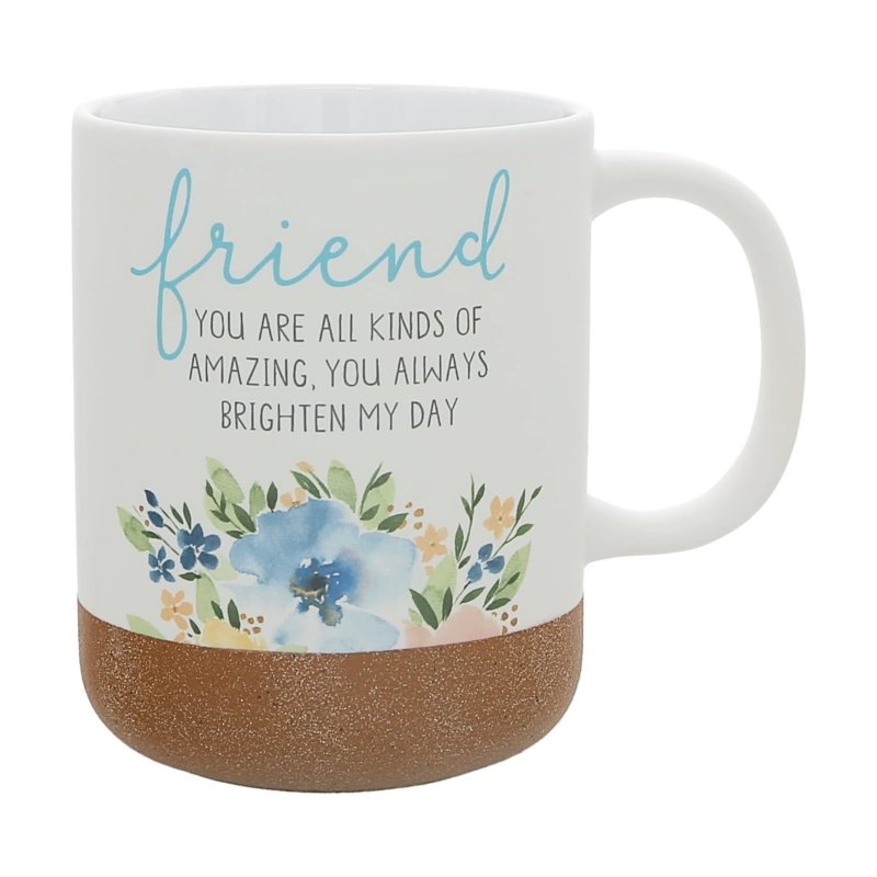

Most Pantone mug printing briefs contain one line: match Pantone 485 C. That line is treated as a specification, but it is only a reference. A fan deck describes ink printed on paper under a defined light, while a mug is pigment fused into glaze over fired clay and then curved so the eye meets it at an angle. Nobody has said what a match means, how it will be measured, or what size of miss is acceptable, and that gap is where colour disputes start.
This guide is for brand and packaging teams who need predictable colour on a ceramic body. It explains what a reference controls, how a measured colour difference turns an argument into a number, and how to run an approval from digital proof to a signed fired sample.
Key takeaways
- A Pantone number is a reference, not a recipe: it describes ink on paper, not pigment fused into glaze.
- Agree a colour difference band before the sample: 1–2 is typically near-invisible, so state what your artwork can accept.
- A fired proof beats a screen proof: a sample takes 7–10 days after artwork approval and is the only colour reference.
- Decal colour arrives in a third fire: decoration is typically fired around 750–850°C to fuse into the glaze.
- Hold colour with a retained sample: measure each batch against the signed master, not a fresh fan deck.
1. Why matching a reference is not a specification
At a glance: a reference fixes an aim point, while the mug adds glaze, firing, pigment thickness and curvature, so it has to become a target you can measure.
A Pantone number identifies a colour under a defined viewing condition on a defined substrate. Move from coated paper to a glazed ceramic wall and the result changes, because the surface reflects light differently and the glaze sits over the pigment. The reference still points somewhere useful; it just stops being the answer, and it says nothing about how close is close enough. What replaces it is a target, a tolerance and a signed sample, which is where our customisation process begins.
2. Reference versus process
At a glance: the printing process decides how close to a reference you can get, so choose the process before arguing about the number.
Screen print lays a relatively thick, opaque layer of ceramic colour and holds solid spot references well on flat areas. Decals carry finer detail and more colours, but the colour passes through a third fire and shifts slightly on the way. Sublimation needs a polymer-coated body and builds colour from process inks, so it reproduces photographs well and spot references poorly. Metallic finishes sit outside the system entirely: a gold rim is a glaze effect with no Pantone equivalent, and it also cannot go into a microwave.
| Process | Reference it handles best | Realistic expectation | Best use |
|---|---|---|---|
| Screen print | Solid spot colours, one to three | Close on flat areas; limited shade steps | Bold logo on one panel |
| Decal | Multi-colour references and fine detail | Close after the third fire, with a small shift | Detailed logos and gift ranges |
| Sublimation | Process colour and photographs | Good tonal range; spot colours drift | Photo and full-colour wraps |
| Gold rim or metallic | No Pantone equivalent | Lustre varies with angle and firing | Premium accent, not microwave-safe |
| Laser engraving | No colour reference | Tone comes from the body, not from ink | Permanent marks on dark glaze |
3. Colour difference as a measurement
At a glance: a measured colour difference turns a vague objection into a number both sides can agree on, read from the fired surface.
Colour difference metrics express how far two samples sit apart in a way that roughly tracks visibility: small values mean the eye struggles to separate them, larger ones mean it does not. On glazed ceramic a difference of about 1–2 is typically close to the limit of casual notice, which makes it a sensible place to start a tolerance. Read the difference from the fired surface, under a stated light, against the signed master. A flat brand colour on logo mugs is where a tight band pays for itself, because there is no texture to hide drift.
4. The approval sequence from proof to fired master
At a glance: every stage before the fired sample is cheap; the fired sample is the only proof that survives a change of screen or light.
Pantone mug printing is a sequence rather than a single approval. A digital mockup shows placement and colour intent within one hour of a complete brief. A physical sample follows in 7–10 days after artwork approval, and the sample fee is credited against the production order. What you sign at the end is the master sample, and production is measured against it. A Launch Kit arrives 3–5 working days after approval with a spec sheet, print-ready dielines and two rounds of revisions, so colour, coverage and packaging leave the studio together. See what the Launch Kit includes.
| Step | What is produced | What you approve | Time |
|---|---|---|---|
| 1 Brief | Reference, body, finish and process | The target definition | Before artwork |
| 2 Mockup | Artwork placed on the body | Placement and colour intent | Within 1 hour |
| 3 Print trial | A fired sample of the decoration | Colour, registration and finish | 7–10 days after approval |
| 4 Measurement | Colour difference readings | The tolerance band | With the sample |
| 5 Master sample | A signed physical reference | The standard for production | Before scheduling |
| 6 Batch check | Measured pieces and a photo QC report | Shipment release | 30–45 days production |
5. What changes colour on a fired body
At a glance: the same ink on the same body can fire differently, because glaze thickness, body whiteness and kiln position all move the result.
Glaze is the largest variable. A fraction more glaze deepens a pale colour and shifts a mid-tone warmer; a thinner coat lets the body whiteness through and cools it. Pigment film thickness works the same way, because heavier print darkens and can pool at the edge of a panel. Firing adds the rest: position in the kiln, the profile of the cycle and the number of fires each move saturated colours, so the kiln record belongs in the colour conversation. An interior colour changes perception too, and a dark inside on colour-inside mugs makes the same exterior read lighter at the rim.
| Variable | Effect on the fired colour | What to control |
|---|---|---|
| Glaze base and thickness | Shifts hue and depth, especially on pale references | One glaze recipe and dipping standard |
| Body whiteness | Makes the same print read warmer or cooler | One body per program |
| Pigment film thickness | Heavier print darkens and pools at edges | Print parameters held across the run |
| Firing and kiln position | Over-fire fades saturated colours | A recorded kiln profile per batch |
| Number of fires | Each additional fire can move the colour again | An agreed decoration sequence |

6. Holding colour across reorders
At a glance: a colour that cannot be repeated is not a specification, so the retained master sample and a batch measurement are what hold it.
Fan decks age and get replaced; a signed sample does not. When a reorder arrives a year later, the approved mug is the reference, and any change in body, glaze or process is raised before production. Coverage makes the difference visible, because a narrow print hides drift that a wide one exposes, as the full-wrap comparison sets out. Ask for the tolerance band to be written into the quote, then measure the batch against it before shipment.
7. The colour brief in five lines
At a glance: five lines carry the whole agreement: the reference, the body and finish, the process, the tolerance and the signed sample.
- Name the reference and say whether it came from a coated or uncoated deck.
- Name the body and finish, because a gloss and a matte mug are different targets.
- Name the process: screen print, decal or sublimation, not the word print.
- State the tolerance as a measured band, on a stated area and light.
- Attach the master sample reference and require that same one on every reorder.
Those five lines do more than settle a colour. They tell a printer what to protect when two goals collide, and they give a buyer something to point at that is not an opinion. The wider set of substrate and finish questions sits in our materials, printing and finishes section.
How MugFactory de-risks colour approval
MugFactory prints custom ceramic, bone china and stoneware mugs on exclusive Liling lines, with design, QA and export documentation in one in-house team. Colour is agreed on the fired body: the reference, the process and the tolerance are settled before production, and the approved sample is kept as the reference for every later run.
- A free digital mockup within one hour of a complete brief.
- A physical sample in 7–10 days after artwork approval, with the fee credited against the order.
- Master-sample approval before production, held as the colour reference for the run.
- Colour difference and registration measured during production, with kiln records kept per batch.
- A photo QC report before shipment, so the batch is checked before it leaves Liling.
Test the body and the finish first
Tell us the reference, the body and the finish. We will send a sample route with the tolerance band we would measure against, so colour is approved on a fired mug rather than a screen.
FAQ
Can you match a Pantone colour exactly?
Exactly is not a promise a ceramic printer can make. A reference is defined for ink on paper; on a fired, glazed body the pigment shifts, and some references have no ceramic equivalent. What can be agreed is a target, a process and a measured tolerance, confirmed on a fired sample.
What ΔE is acceptable on a fired mug?
There is no universal figure, and the decision belongs to your brand. A difference of about 1–2 is typically close to the limit of casual notice, so many approvals set the band there for a flat brand colour and allow more on a photographic wrap.
Why does the fired colour look different from the proof?
Because a proof is light off paper, while a mug is light reflected through glaze over pigment and curved away from the eye. The glaze adds depth, the fire shifts hue, and the viewing angle changes the reading again. A fired sample, seen in the light your customer will use, is the only honest comparison.
Does coated or uncoated Pantone matter?
It matters less than buyers expect on ceramic. Coated and uncoated references describe ink on different paper stocks, and neither describes glaze on clay. Use the reference as an aim point, then let the fired sample and the measured difference define what the process delivers on that body.
Can you hold colour across reorders?
That is what the master sample is for. We keep the approved sample and the batch records, measure each run against it, and check the finished pieces before shipment. A reorder reproduces the approved sample rather than a fan deck that may since have been replaced.
Sources

MugFactory’s sourcing and production team helps brands, retailers and distributors plan custom ceramic mug programs from 500-piece pilots to annual production. Based in Liling, close to the lines, the team covers design, packaging, QA, export documents and after-sales.